What Little We Know About The Life and Art of Clara Gregory Lindsay
In 1891, Clara Gregory Lindsay became one of the earliest women to show her artwork in Hawaiʻi. It’s possible she is the first female painter of Hawaii’s renowned Volcano School. Although long forgotten, Clara was a socialite. With a generous spirit, and creative force whose paintings reflected the vitality she brought to her community.
Her work, ranging from ink portraits to a luminous 1895 volcano painting, reveals a woman who possessed a deep connection to the culture and radiant landscapes of Hawaii.
Early Life and Arrival in Maui
Born Clara Fowler Gregory in Illinois on March 29, 1867, Clara suffered the loss of both her parents before she was six years old. Her parents were originally from New York and Connecticut. By the late 1880s, she had moved to Hamakua-poko, Maui, to live with her aunt and uncle, Mr. and Mrs. Charles Loveland. The Lovelands were respected figures in the island’s missionary and civic community.
Historical records show her name in various forms, including Claire, Clare, or Clara, often with the middle or family names Fowler (or Fowlar) and Gregory.
Artistic Recognition and Style
Lindsay’s art is technically refined and publicly admired. She worked in diverse mediums including pencil, pen and ink, watercolor, and oil painting, transforming Maui’s lush landscapes and Hawaii’s fiery spectacles into intimate visions of beauty. Visitors to her Makawao home specifically praised her ability to capture the unique color effects of the island scenery.
Her first major public recognition occurred in 1891. The Honolulu Star-Bulletin reported that “Miss Clare F. Gregory… has just completed an India-ink portrait of his late Majesty,” which was exhibited at King Bros’ art store. The publication highly praised the life-sized bust of King Kalakaua, noting that “Miss Gregory’s pencil has been quite active, and its productions entitle her to a high place among local artists”.
A Rare Female Voice in the Volcano School
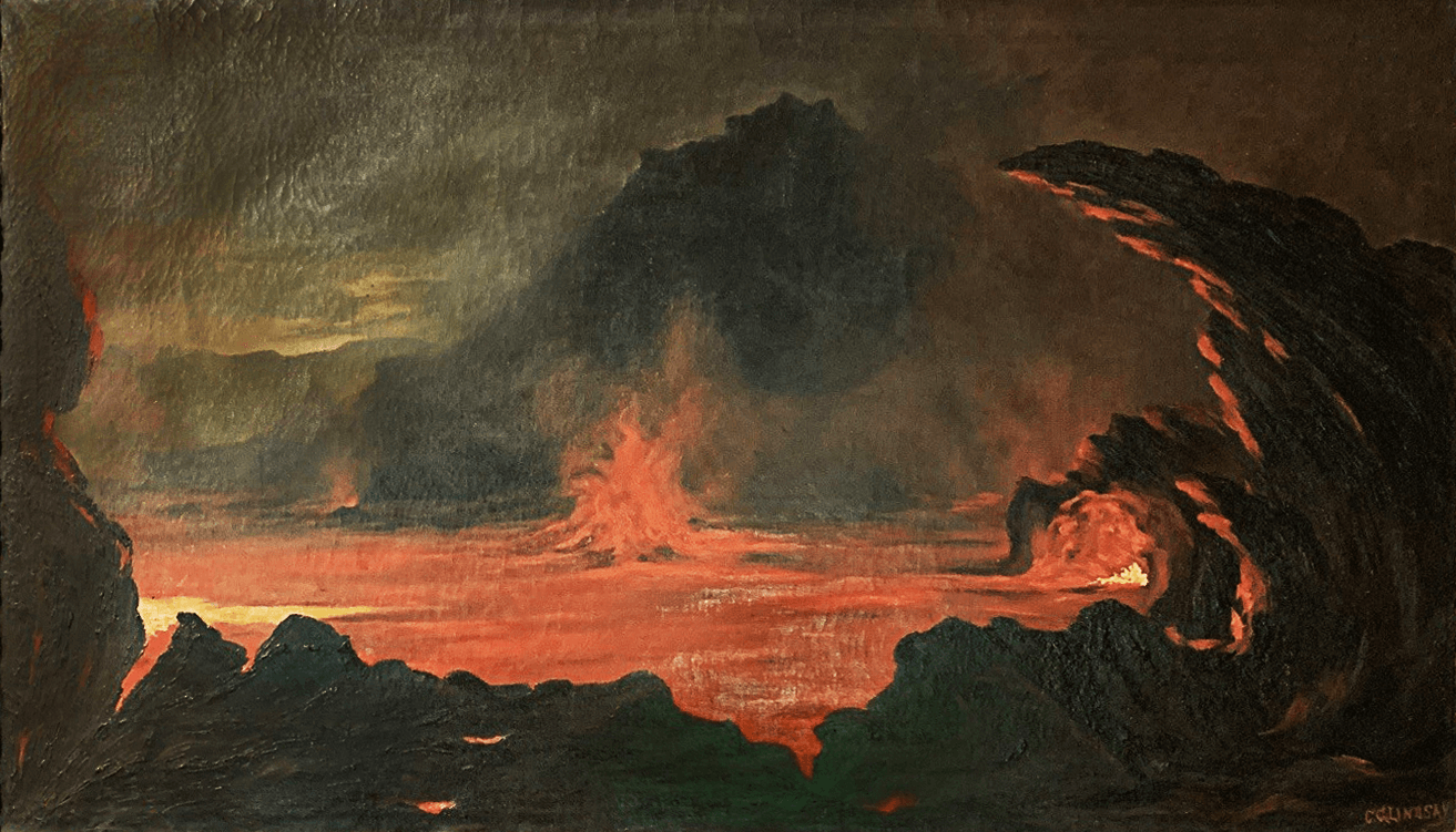
A significant surviving work, “Volcano at Night” (1895), places Lindsay within the closing phase of Hawaiʻi’s celebrated Volcano School. The Volcano School was an informal circle of painters active between 1880 and 1900 who depicted volcanic landscapes of Hawaii.
This 40 x 23-inch oil on canvas depicts Kīlauea’s Halemaʻumaʻu Crater, featuring a molten lava lake that illuminates the ridges and clouds with a fiery glow. The composition, with its swirling arc of dark rock and hints of blue, recalls the palettes and aesthetics of renowned artists Jules Tavernier and Charles Furneaux.
Painted six years after Tavernier’s death, Lindsay’s work demonstrates that the tradition continued well into the 1890s and represents an extremely rare female perspective within the Volcano School movement.
Marriage and Community Service
On July 25, 1894, Clara married David Colville Lindsay, a bookkeeper for the Paia Plantation, at the Makawao Protestant Church. Settling in Paia, Clara became a leader in community and church affairs.
She combined her artistic life with civic service, teaching Sunday School and leading charitable projects. By 1895, she was elected president of the Makawao Ladies’ Aid Society, working alongside other prominent women in education and philanthropy. Her dual role as an artist and community builder embodied the late-Victorian ideal of uniting beauty with benevolence.
Death and Legacy
One of her last known artistic commissions was a pen-and-ink enlargement of a portrait of Hon. H. P. Baldwin, which was displayed at the Baldwin National Bank of Kahului and noted for its accuracy.
Tragically, Clara Gregory Lindsay died on June 16, 1912, at the age of 45, due to complications following an appendectomy at Paia Hospital. She had recently returned from a visit to Scotland, and her sudden death was a shock to the Maui community. She was survived by her husband, four daughters, and her aunt.
Clara Gregory Lindsay occupies a vital, yet long-overlooked, place in the story of women artists in Hawaiʻi. She expanded the Volcano School tradition beyond its masculine origins ensuring that a woman’s vision of Hawaiʻi’s natural sublime would endure on canvas.
Known Works
- India Ink Portrait of King Kalakaua (1891): Exhibited at King Bros.’ Art Store, Honolulu.
- “Volcano at Night” (1895): Oil on canvas depicting Kīlauea’s Halemaʻumaʻu crater; signed “C. G. Lindsay”.
- Portrait of Hon. H. P. Baldwin (c. 1911–12): A pen-and-ink enlargement displayed at Baldwin National Bank.
- Watercolor Landscapes of Maui: Various dates; mentioned in her obituary as widely admired.
Author’s Note: Reconstructing a Lost Legacy
This post has been pieced together from limited research, including 19th and early 20th-century newspaper archives, probate records, census data, and surviving artworks. These fragments reveal a woman whose artistic and civic contributions were deeply intertwined and who serves as a vital link between the missionary generation and the emergence of modern Hawaiian art.